

Sound familiar?
You deliver a real result, but it isn’t the one in the brief.
The brief
The company was moving to hybrid work and people weren’t coming in. The ticket asked for a desk-booking tool and “please, improve some UX”. Leadership’s goal was 60% office attendance, up from 41%. Attendance was a KPI set for managers.
The numbers on day one
Office time by age
- 32%21–25 year-olds
- 45%25–32 year-olds
- 58%32–40 year-olds
18 min
Average time managers spent scheduling
31%
Desk utilisation, only
What I found
Managers spent 18 minutes on average scheduling, and desk utilisation sat at 31%. One manager spent about 20 minutes picking people for a weekly review. Managers owned the KPI, but their real pain was coordination. I chose to fix the pain first, and I never said that out loud.
The pivot
From booking one desk at a time to coordinating a whole team, with proximity built in.
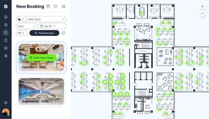
The change that mattered: automatic nearby-seat selection highlights available desk clusters on a given day, so a manager books several adjacent workspaces in one action.
Where I got it wrong
At the first review I led with the manager numbers. The room asked a fair question: where’s the 60%? I had measured what we moved, not what they asked for. For two weeks the project read as a miss.
The fight
Then the feedback came in. Users wanted to book from their phones, and at delivery the mobile interface was designed but not yet built. I presented the mobile prototypes alongside that feedback. We agreed the path to 60% ran through mobile. We’ll check the numbers two weeks after the iOS and Android versions are available, then every month.
What shipped
Templates, a clustering algorithm for team seating, calendar integration and visual desk mapping. Meeting-planning time fell by 68%.
- Flexible booking templateswith customisable repeatability
- Calendar integrationwith office location and visual desk mapping
- Smart clustering algorithmfor automatic team seating
- Mobile appdesigned at handover, iOS and Android to follow
The interface
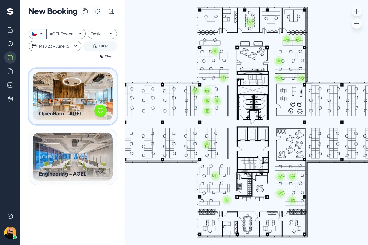
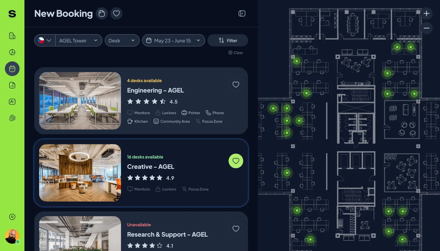
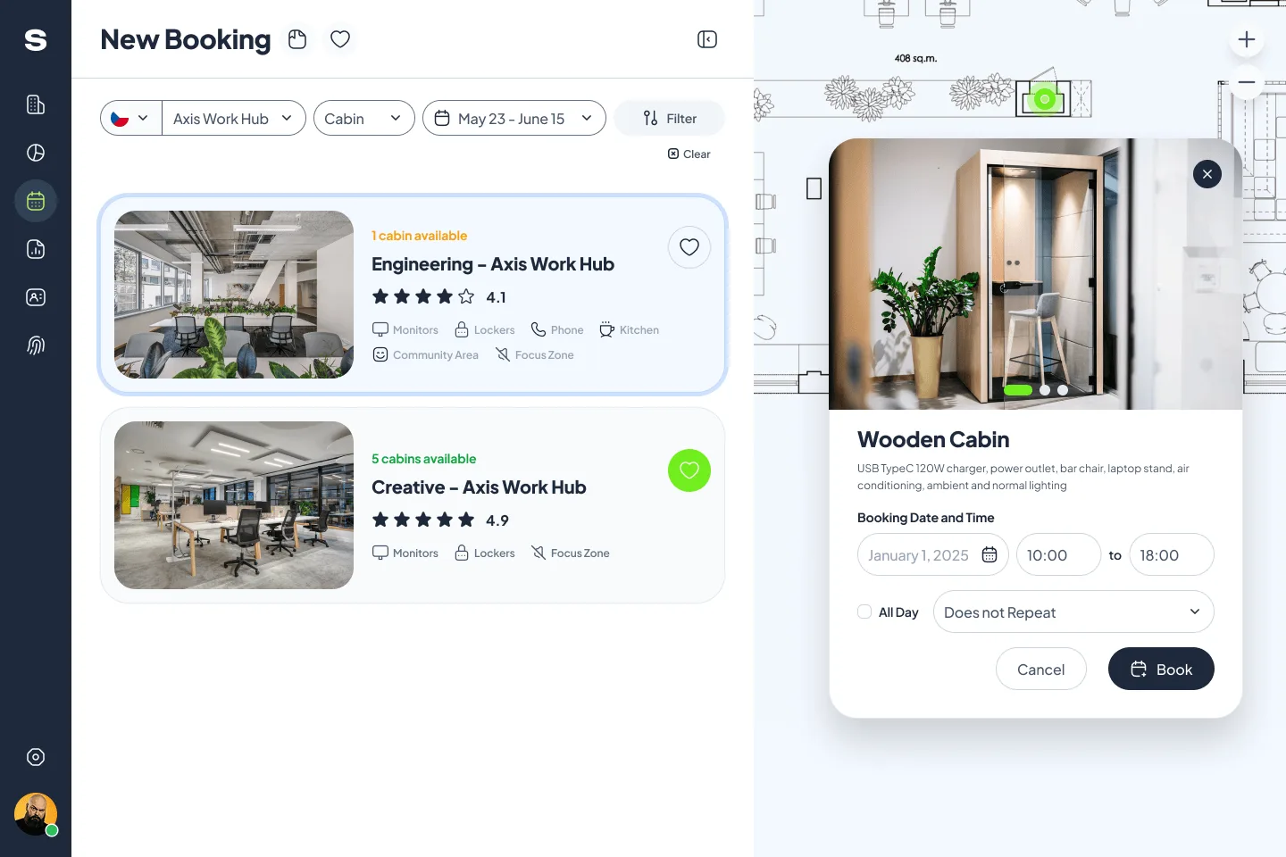
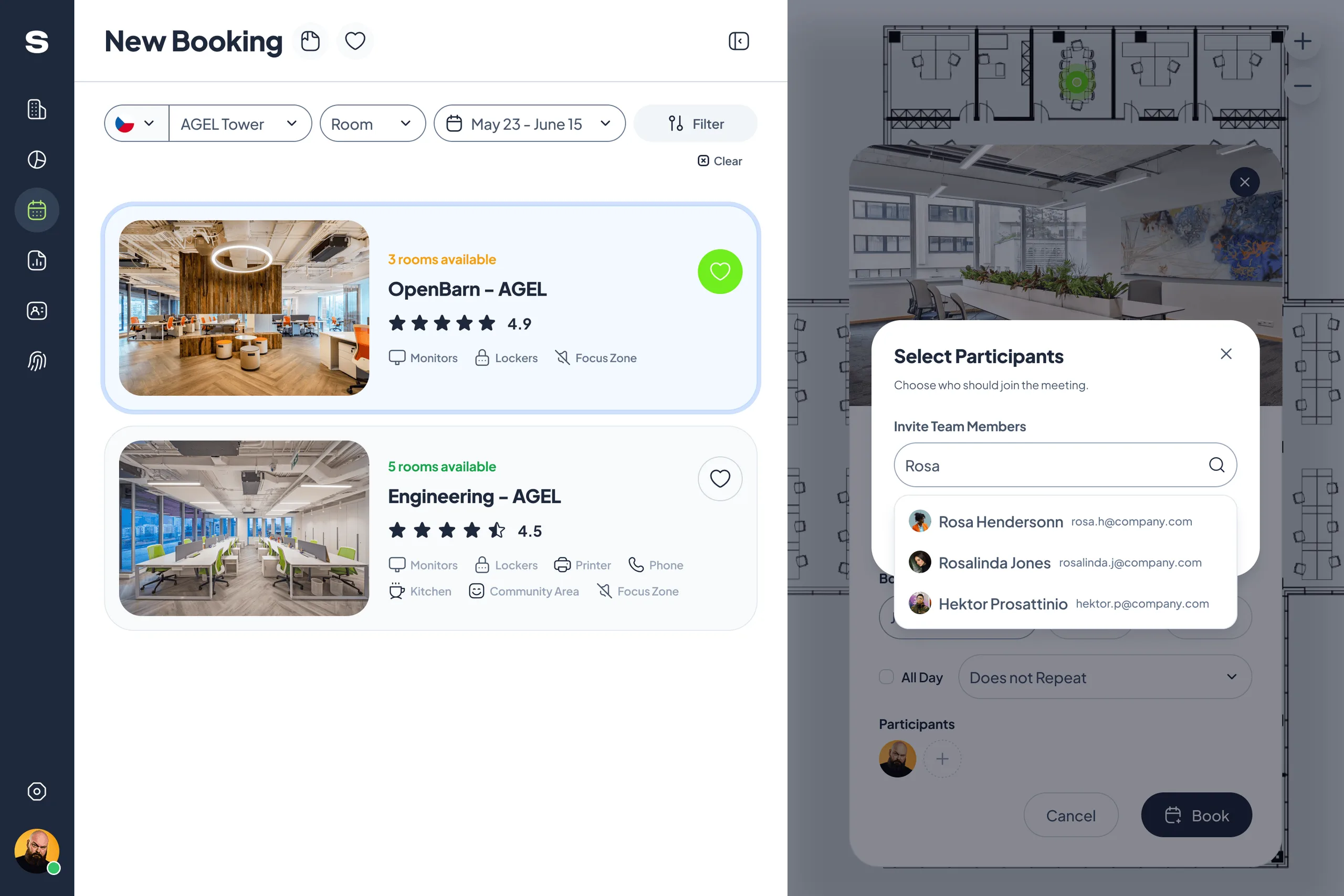
Ten screens from the desktop product, from the first empty booking to team seating, templates and reports.
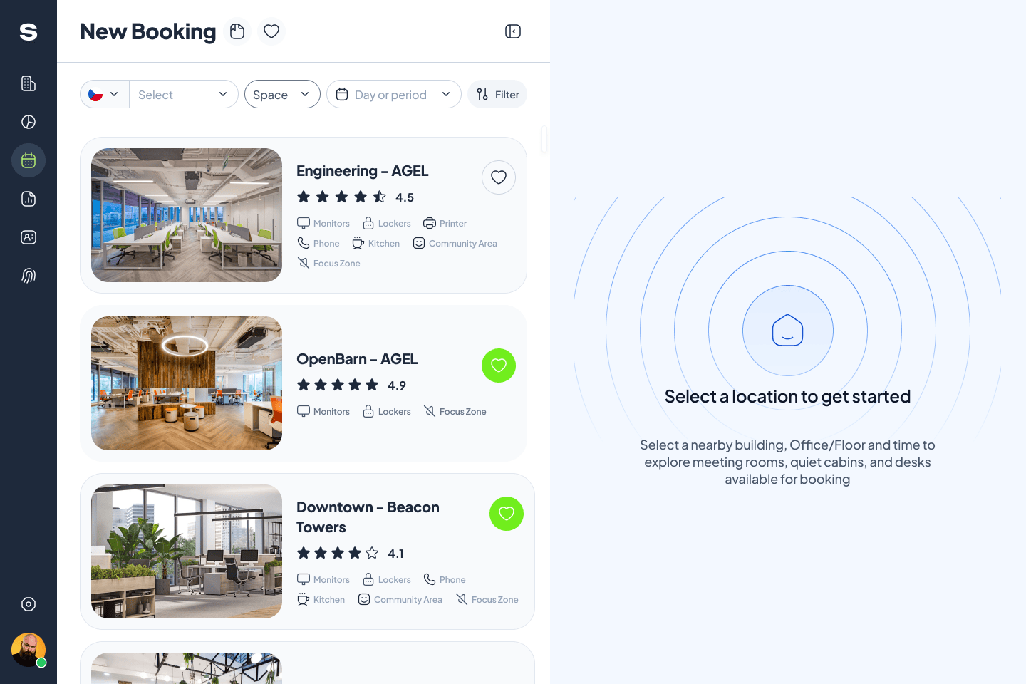
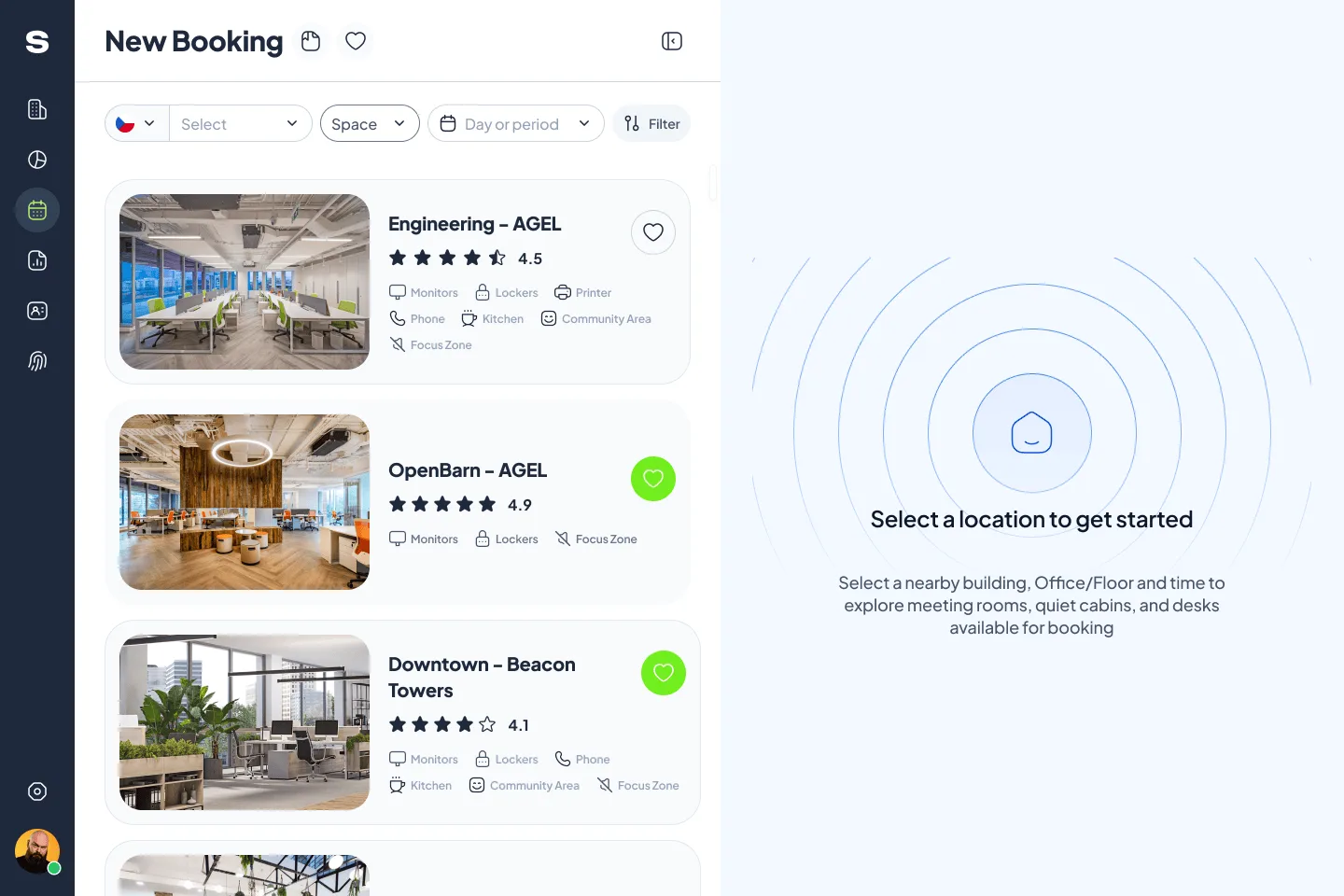
A new booking starts emptyPick a building, a space type and a period; the floor plan waits for a choice. 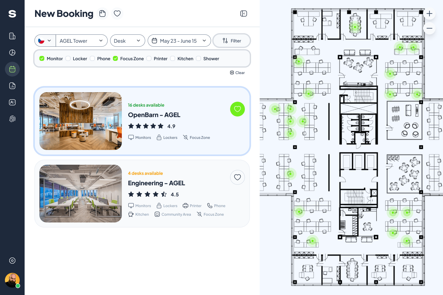
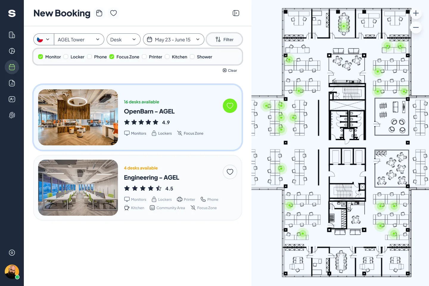
Filtering desks by what they offerMonitor, locker, phone, focus zone, printer, kitchen and shower narrow the list of spaces. 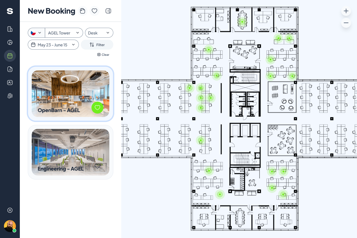
A narrower list gives the plan roomWith the side panel collapsed, the floor plan takes most of the screen. 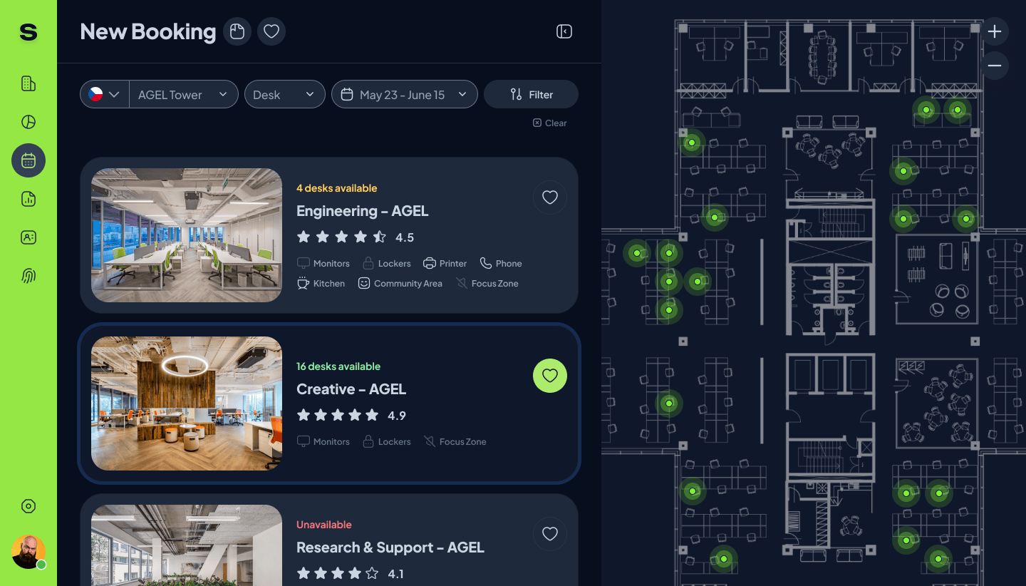
Desk booking in the dark themeEach space shows how many desks are free, its rating and its amenities. 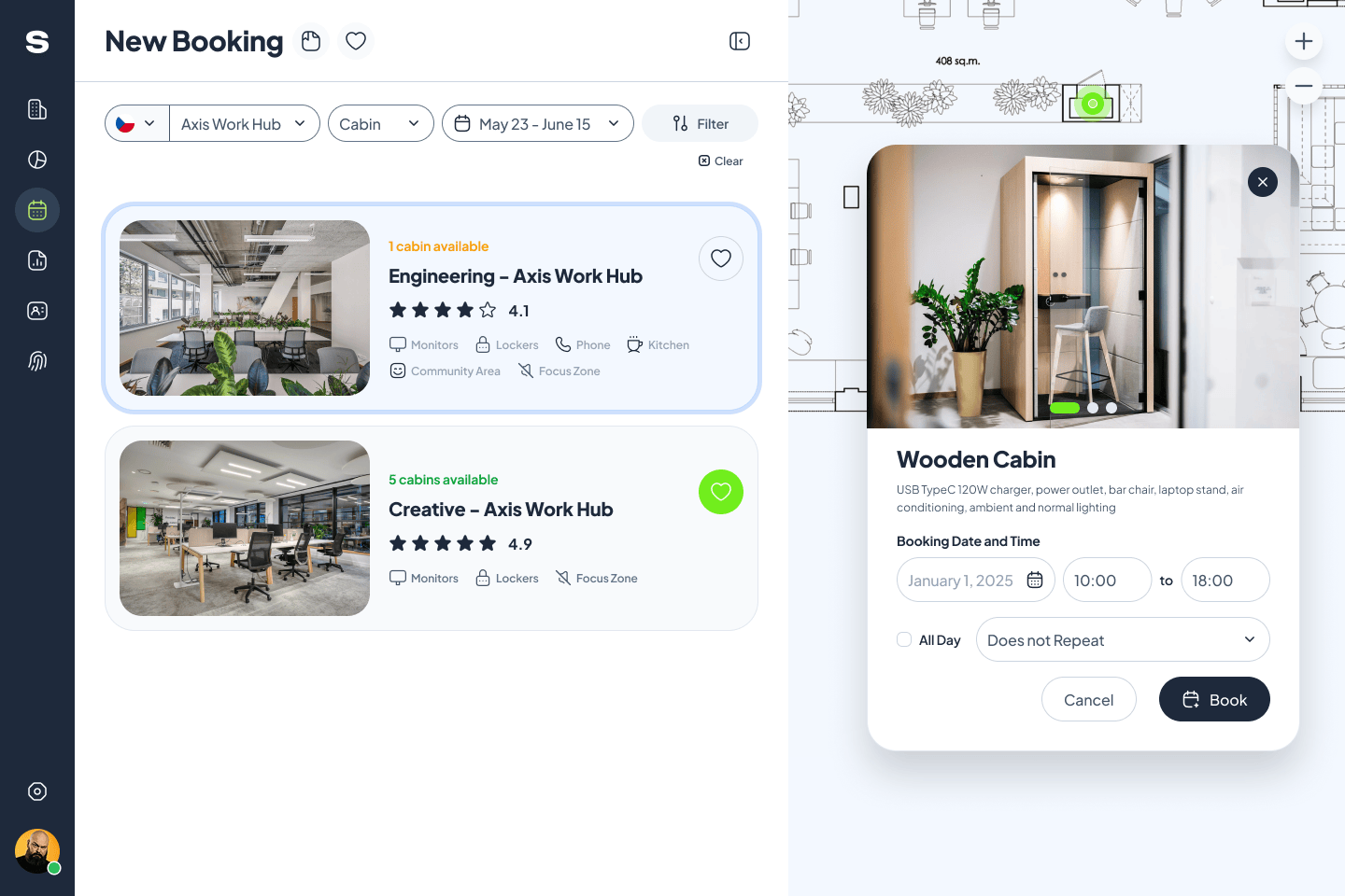
Booking a cabinA cabin opens as a card with photos, amenities, date, time and repeat options. 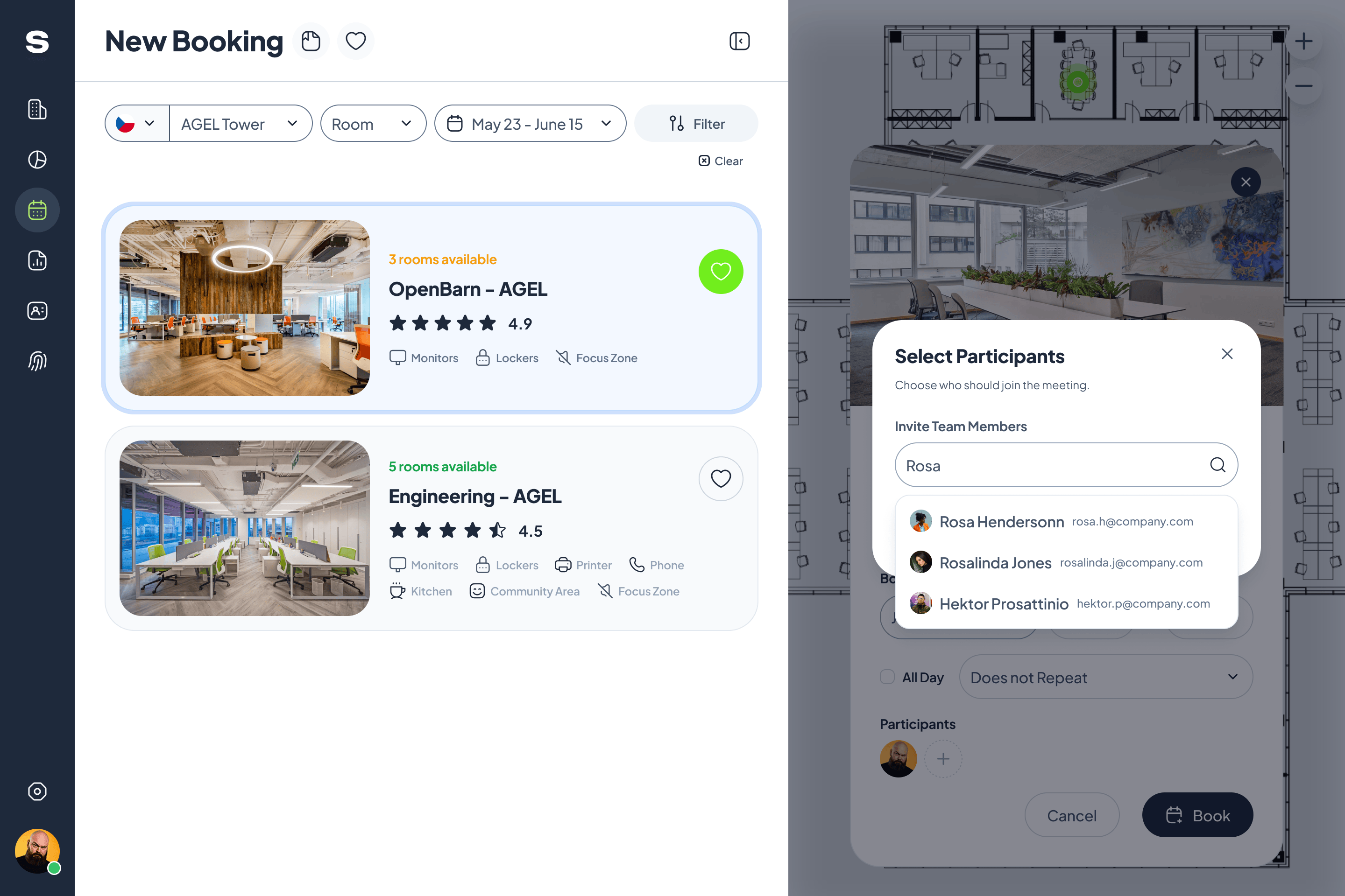
Booking a room with its participantsTeammates are found by name while the room is booked. 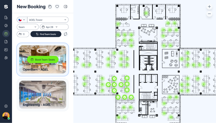
Find team seatsDesk clusters light up on the floor plan, and one button books them together. 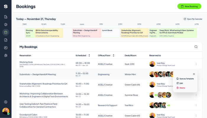
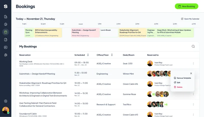
Bookings, and the save-as-template actionA day timeline above the booking list; the row menu offers Save as Template, Edit and Delete. 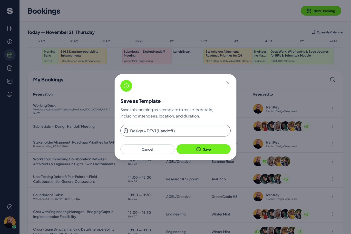
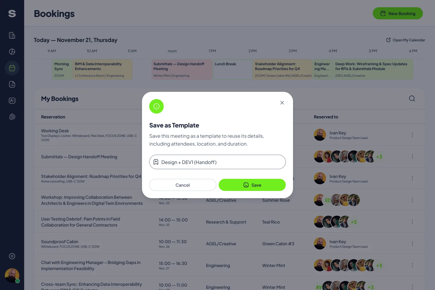
Saving a meeting as a templateName it once; attendees, location and duration come back with it. 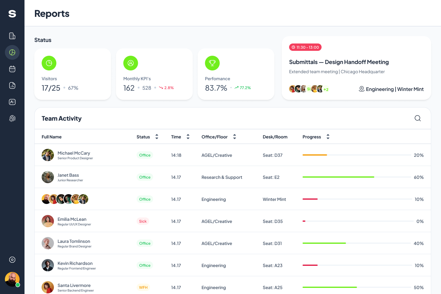
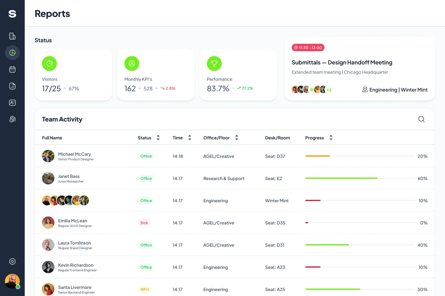
ReportsVisitors, monthly KPIs and performance above a team activity table by office, floor and desk.
What didn’t land
Attendance reached 47% and is still growing. It isn’t 60% yet, and this page doesn’t claim it. Mobile booking is what users asked for, and it wasn’t available at handover. We’ll check the numbers two weeks after the iOS and Android versions are live, then monthly.
The pattern
Before the first review, I now name the number I moved, the number I didn’t, and who owns each.
If that sounds like what your team needs, the first conversation is free.